2. Using the Correlation Matrix
The Correlation Matrix shows the correlation between a grid of selected symbols. For example:

Each cell in the matrix is color-coded:

It makes little difference whether values are positive or negative (e.g. +90 or -90), and the meaning depends on whether you are long or short each symbol. For example:
- +90. If you are long both symbols, or short both symbols, then you will tend to see identical profits or losses on both positions. If you are long one symbol and short the other, then you will tend to have a matching profit and loss.
- -90. If you are long both symbols, or short both symbols, then you will tend to have a matching profit and loss. If you are long one symbol and short the other, then you will tend to see identical profits or losses on both positions.
The chequered cells show rows and columns which are the same (i.e. correlation of EURUSD against itself is meaningless). The grid is symmetrical either side of the chequered line: e.g. the correlation of EURUSD against USDCHF is the same as the correlation of USDCHF against EURUSD.
2.2 Changing the parameters for the calculation
You can use the fields at the top of the matrix to choose a timeframe (e.g. H1, D1) and a number of historic bars (e.g. 25, 100, 500).
Correlation between symbols changes over time, and recent correlation may not continue in future. As a general rule, the settings which you choose should be related to how long you intend to keep open positions for. For example, if you expect a position to be open for 24 hours, you might want to look at H1 correlation over the last 50 or 100 bars (roughly 2 or 4 days).
You can choose which symbols to include in the Matrix by using the … button. This shows the list of symbols which are currently being displayed, and a list of all available symbols.
2.3 Highlighting correlation strength The strength field, next to the bars field, lets you highlight different types of correlation in the grid. For example, if you pick “Strong” then the grid highlights correlation above ±75, and grays out all weaker correlations.
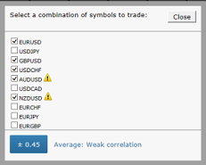
2.4 Trade list
The Trade List button shows the average correlation between a list of selected symbols – for example, positions you are currently trading, or positions which you intend to open in future. The list shows the average correlation, and also marks any symbols which have strong correlation with another symbol on the list. In the following example the overall average is weak correlation, but AUDUSD and NZDUSD have strong correlation with each other: